CSS’de Flexbox kullanmayı seviyorum ve bu harika bir şey, önceden birçok farklı CSS kuralı yazarken Flexbox ile sadece bir satırda istediğim görüntüyü alabiliyorum.
Burada Joy Shaheb’in paylaşmış olduğu “FlexBox Cheat Sheets in 2021 || CSS 2021” makalesini paylaşmak istedim umarım işinize yarar.
İçindekiler
- FlexBox Architecture
- flex-direction
- justify-content
- align-content
- align-items
- align-self
- flex – grow | shrink | wrap
- Short Hands
It’s 2021! Let’s refresh Our CSS Flexbox Memory. Here’s a Cheat Sheet of everything you can do with CSS flexbox to get started in 2021.
FlexBox Mimarisi

FlexBox Chart —

flex-direction
The Direction/Orientation in which flex-items are distributed inside flex-container.


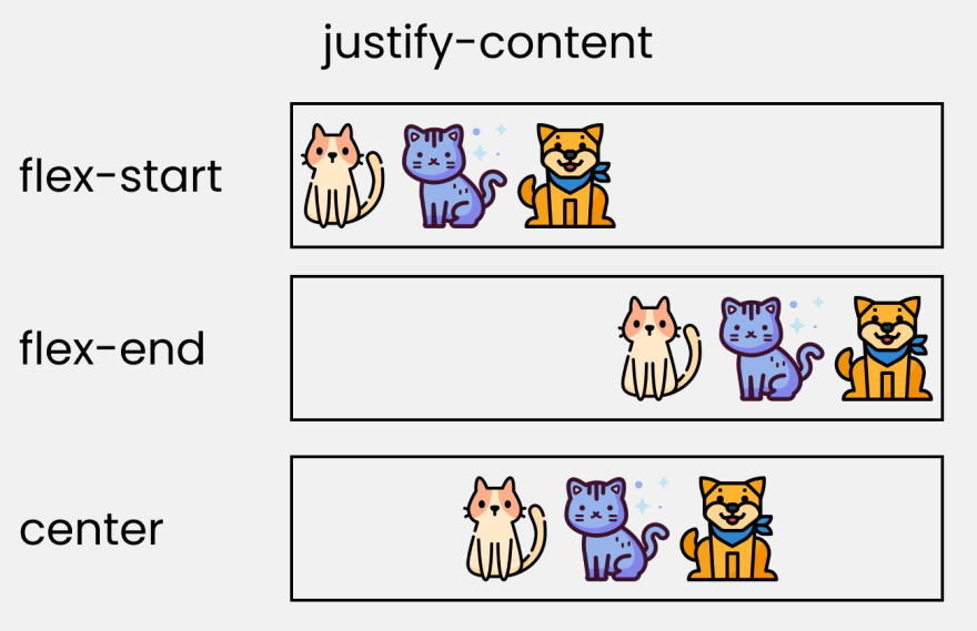
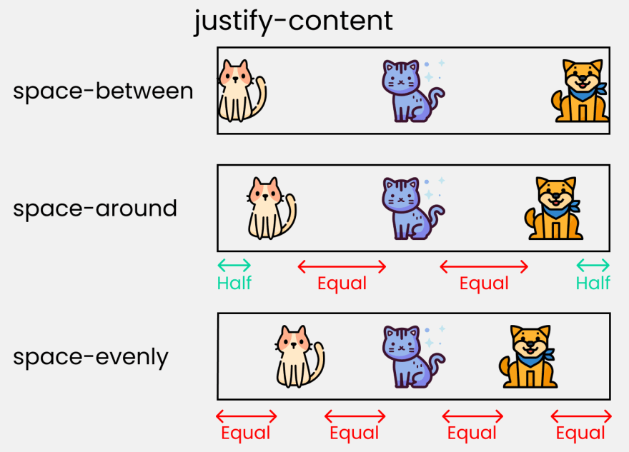
justify-content
This property arranges flex-items along the MAIN AXIS inside the flex-container


align-content
This property arranges flex-items along the CROSS AXIS inside the flex-container. This is similar to justify-content


align-items
Distributes Flex-items along the Cross Axis

align-self

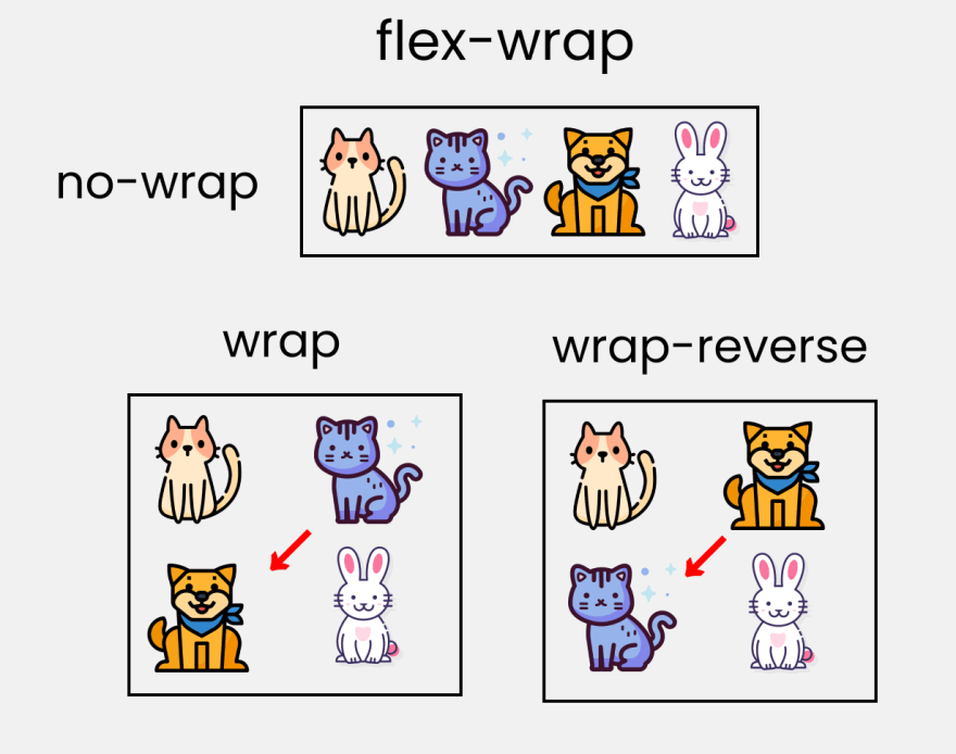
flex – grow | shrink | wrap
- flex-grow : grows the size of a flex-item based on width of the flex-container.
- flex-shrink : The ability for a flex item to shrink based on width of the flex-container. Opposite of flex-grow.
- flex-wrap : Amount of Flex-item you want in a line/row.


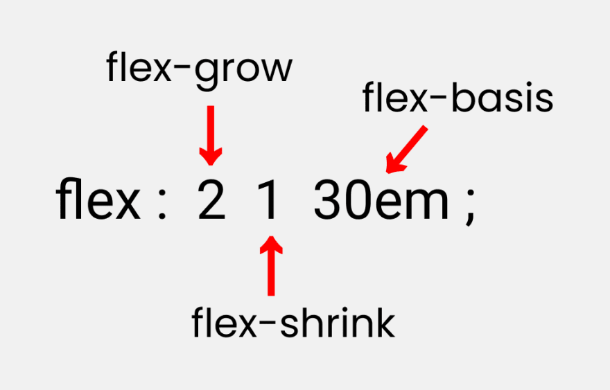
Short Hands
- flex : It is a shorthand to flex-grow, flex-shrink and flex-basis combined.
- flex-basis : This is similar to adding width to a flex-item, but only more flexible. flex-basis: 10em; it will set the initial size of a flex-item to 10em. Its final size will be based on available space, flex-grow, and flex-shrink.

Kaynak: https://dev.to/joyshaheb/flexbox-cheat-sheets-in-2021-css-2021-3edl
Ayrıca https://demos.scotch.io/visual-guide-to-css3-flexbox-flexbox-playground/demos/ adresinde denemeler yapabilirsiniz.
